Responsibilities
- User experience
- Interface design
- Data analysis
- Prototyping development
- User testing and research

Results
- Calls made through customer service channels decreased by 41%.
- Ability to receive user feedback regarding the quality of content in the help center.
- Satisfaction rating with the help center increased from 2 to 7 (on a scale of 1 to 10).
The project
The project was born out of the need to redesign the Help Center, which was on a different platform from the rest of the Compra Certa e-commerce. In this scenario, users were forced to log in twice to get help, in addition to other technical limitations and the high cost of the platform.
With this change, there was an opportunity to improve the Help Center and reduce the number of calls opened through phone, chat, and email by encouraging the use of self-service tools.
Project objectives
- Increase in help-center usage: create incentives and attractive features to encourage users to resolve their questions on their own, reducing the number of inquiries via phone, chat, and email.
- Integration: Redesign the help center to integrate it into the same platform as the e-commerce, ensuring a cohesive experience for users.
- Monitoring and analysis of results: measure the impact of changes in the help center and identify ongoing improvement opportunities.
Discovery
We identified the questions that led to phone calls, chat inquiries, and emails, and mapped out the solutions commonly used in the market to better understand the issues with the previous help center.
Searching for metrics
As we didn’t have metrics from the old help center, we shifted our focus to metrics from the call center and the chat and email platform. Due to bureaucratic reasons, we couldn’t access the number of phone calls. Despite these limitations, we managed to establish a great starting point.
Main reasons for calls
- Delivery deadline
- Product cancellation
- Interrupted service
- Delivery issues
- Product, order, or purchase information
- Product exchange
- Delivery complaint
- Late delivery
- Technical assistance or installation
- Order status
- Checkout inquiries
Number of calls
November
Chat: 7712
Email: 2374
December
Chat: 10649
Email: 2009
Januery
Chat: 8707
Email: 1386
With this information, in addition to recognizing the need to improve the post-sales experience, we were able to define the main user inquiries to emphasize in the help center.
Shadowing
We listened to the questions and complaints of the users, as well as the solutions provided by the attendants. Through this interaction, we were able to validate once again the main issues and identify opportunities for improvement in the business model and the e-commerce platform.
- There are many issues with logistics that need attention.
- Users have numerous technical questions about the products, so not only does the content of the pages need improvement, but also the guidance to address the main questions.
- Users are unaware of the option to pay with more than one card. After implementing the phrase “pay with more than one card,” we increased sales conversion in this payment method without cannibalizing other payment options.
- Some items appear available on the site but are not available for the user’s region. This causes confusion and loss of sales. We implemented a notice on the product page with a “notify me when available” form to reduce this frustration.
- Users do not see value in the extended warranty. It is necessary to reconsider its presentation or the proposal as a whole.
Benchmark
To assess how the market addresses user issues through online help centers, the following websites were observed
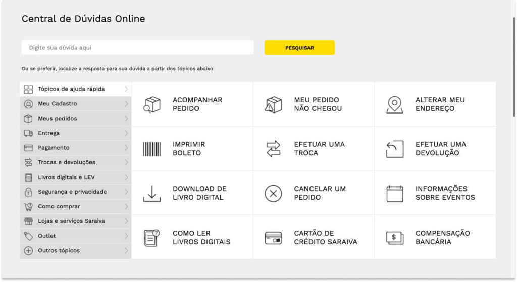
Saraiva and eBay: quick access and intuitive navigation
Both Saraiva and eBay are great examples of information architecture. The categories and subcategories are clear, and the answers are always within three clicks for the user. The focus on quick help topics is undoubtedly a lifesaver.
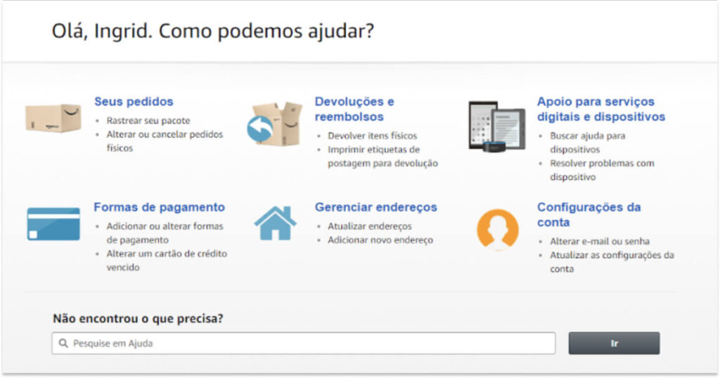
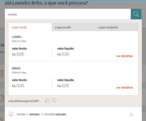
Google Play e Rede: smart search
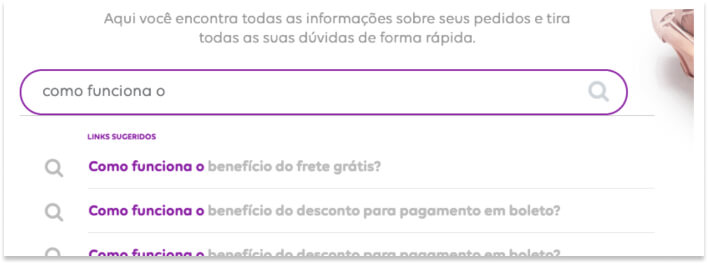
Both sites rely on advanced searches with great accuracy. The Saraiva website goes further by providing information directly in the autocomplete, answering user queries without them needing to navigate to another page.

Analyzing the old help center
In the old help center, the frequently asked questions didn’t make much sense (e.g., terms and conditions of use as the first “frequently asked” question), and the search function wasn’t intelligent.
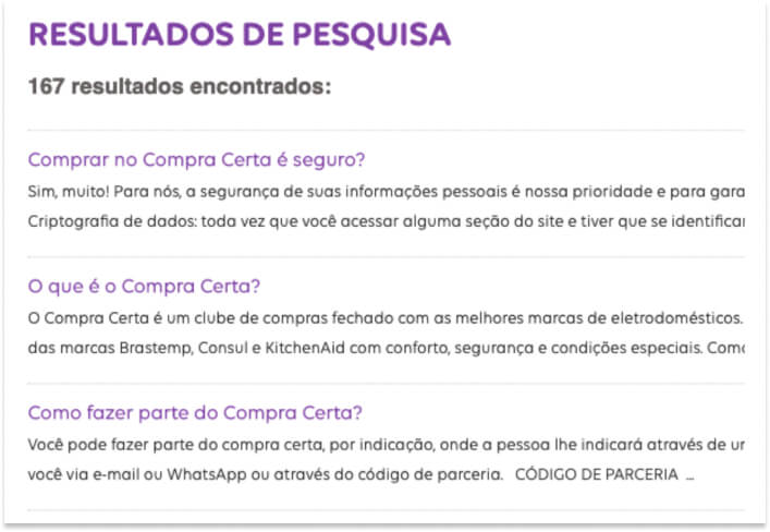
We also conducted a study of the flow of the old help center to ensure that we wouldn’t overlook any necessary pages and to gain an understanding of the issues it had in its structure.
Categorizing the questions
After understanding the old help center and realizing that one of its biggest problems was information architecture, which ended up confusing the user, we recognized the need to recategorize the content within it. We extracted all existing questions from the center and placed them in a table, where we defined a new category for each one.
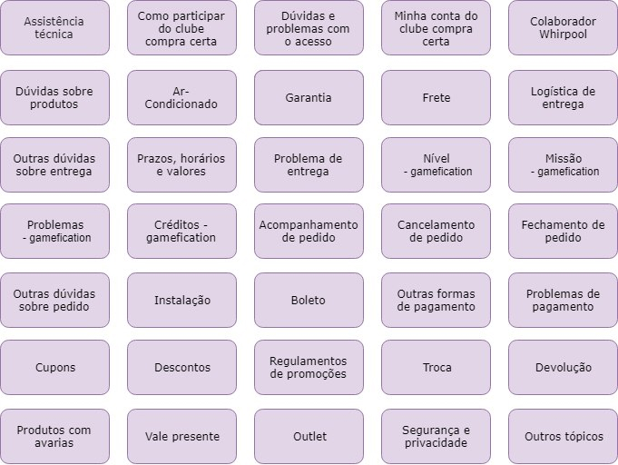
With the categories defined, we decided to group some of them, create subcategories, and test the taxonomy we used for them with our users.
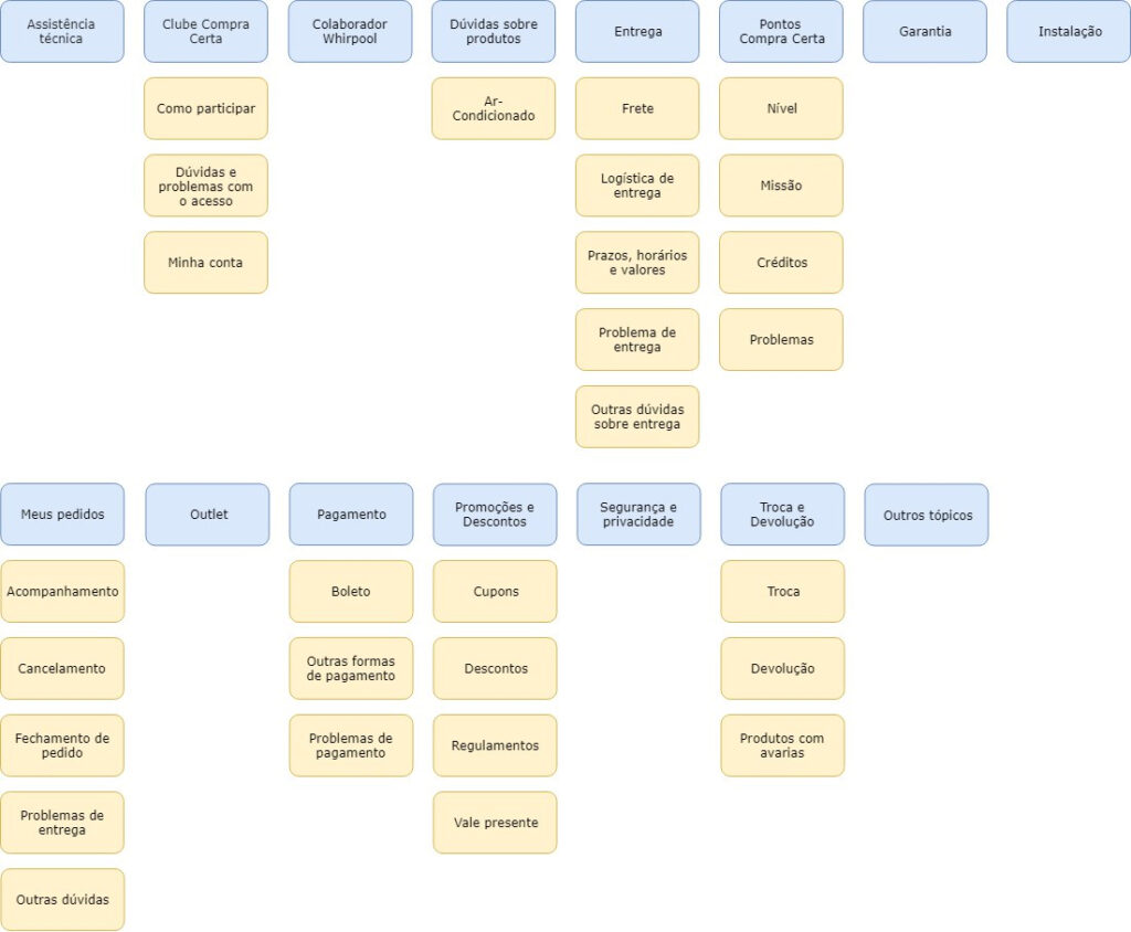
New Information Architecture
With the categories and subcategories defined, it was time to create the new site’s information architecture and determine which pages and features would be necessary, as well as the navigation flow between them.
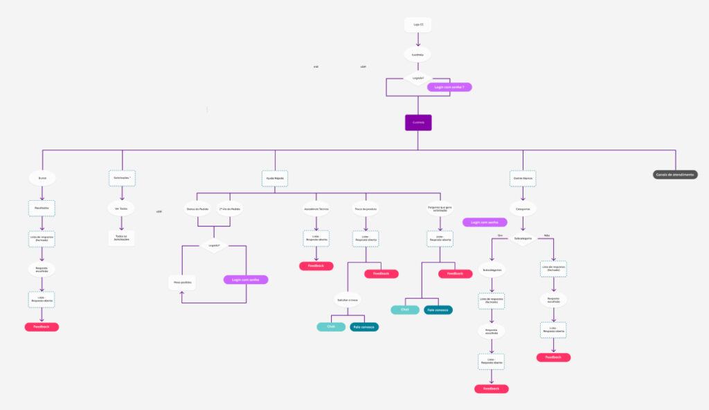
User Journey
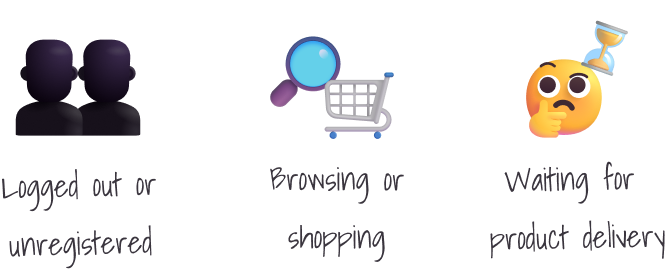
We noticed that since the help center was now within the same platform as the e-commerce, it would be possible to access user information and know at which stage of the purchasing flow they were.
The existing moments were: not logged in/not a member, browsing/shopping, and waiting for the order. With this in mind, we could detect at which stage the user would be and apply the most necessary topics for the situation, with shortcuts for quick access.
Creating the new experience
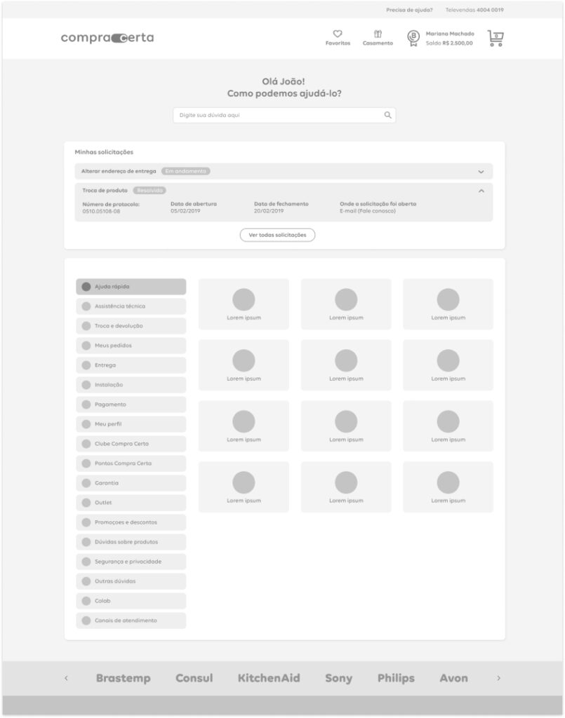
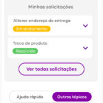
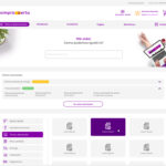
In the new experience, we kept the search function as the main focus and highlighted the status of recent open inquiries.
The quick help tab would be contextualized according to the user’s purchasing stage and would provide answers to the questions that generated the most calls.
Subcategories
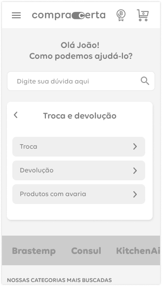
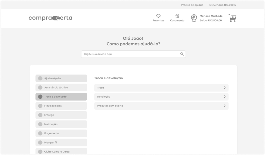
The subcategories on mobile appear within the same block where the categories were previously, while on desktop, the sensation is akin to navigating within an expanded panel. This increases user confidence, making them feel comfortable exploring the content.
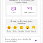
Content quality
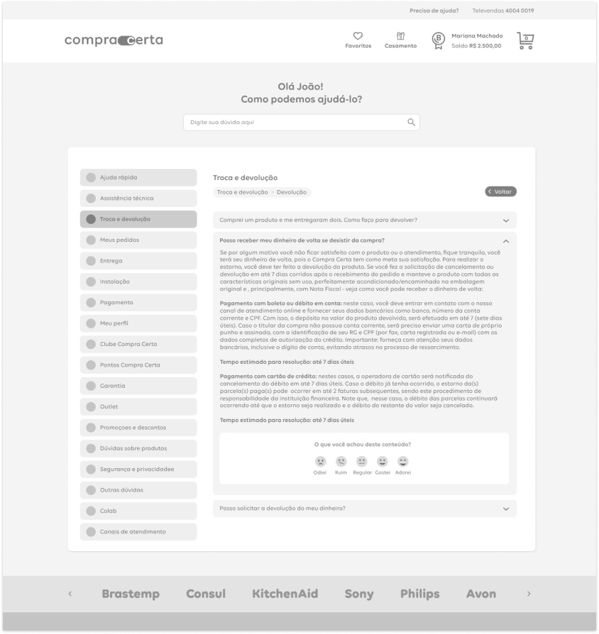
In the end, the content of the help center is the most crucial aspect when it comes to clarifying user doubts. Therefore, we established a new KPI for the future: content quality.
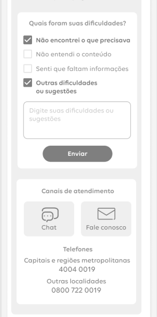
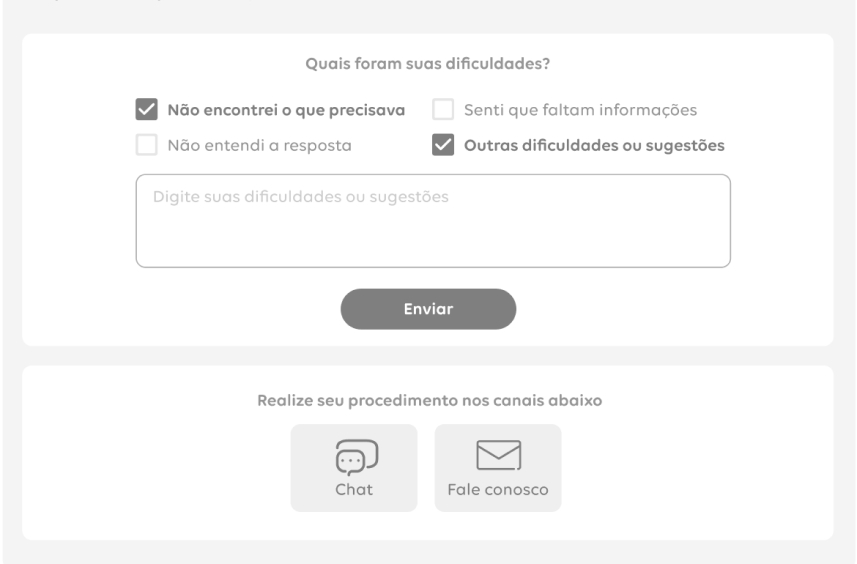
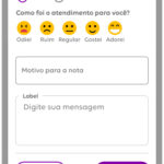
We would consider user opinions on each answer, allowing them to rate it on a scale of 1 to 5. This feedback-based approach would help us continuously improve the content and provide better assistance to users.
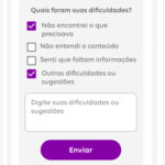
If a user provided an average or lower rating, we would move to a second step where they could provide feedback on what they didn’t like or what they thought was missing from the content.
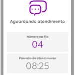
At this point, we would provide options to directly contact the company right there on the platform. This approach aimed to collect feedback and immediately address any concerns or issues raised by users.
Bulletproof Search<span data-metadata="">
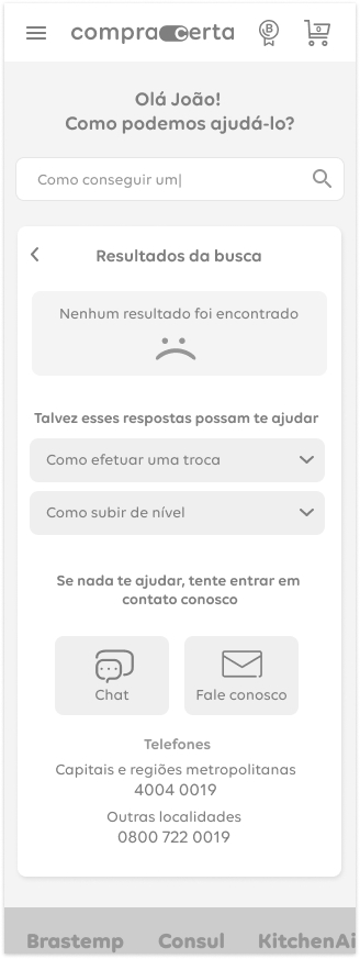
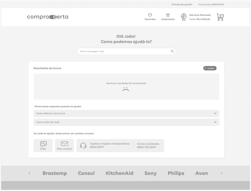
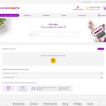
We established that if the search did not yield relevant results, it would provide the user with the most frequently asked questions related to their current situation and the means to contact the company.
This approach aimed to offer alternative solutions and assistance to users, even in the absence of direct matches in the search, ensuring a positive user experience and preventing frustration.
Results
Decrease in the number of calls
With the new self-service help center, our client noticed a 41% decrease in the number of calls made through their customer service channels, resulting in significant cost savings compared to their previous expenses.
Content feedback
With the ability for users to rate the quality of the answers provided in the self-service help center, it will be possible to analyze and refine the available content, further reducing costs.
More satisfied users
At the beginning of the project, we collected customer satisfaction ratings regarding the help center. On a scale of 1 to 10, the help center initially received a score of 2. After the launch of our new center, the satisfaction rating increased to 7.
Next steps
Group the categories into "macro-categories" and test them
We hypothesized that some categories could be grouped together, reducing visual clutter in navigation and making it easier to find answers.
Validating the quality of the answers and including other types of media
It would be necessary to periodically analyze the quality of the help center’s responses. Additionally, it would be beneficial to use other media formats, such as images and videos, to assist users in resolving their issues.
Identify and resolve issues before they occur
Many of the issues users try to resolve when contacting the help center can be avoided if we analyze the purchase experience. Error prevention is the best way to reduce user problems.
Think I can help?
Let's talk!

leandro.mont@outlook.com.br

+55 (11) 98486-1888


